What Font Size Ensures Bus Display Readability from the Back of a Bus?
 2026-04-16
  17:53
17:53 

Optimal font size for bus displays at 5-10m (back of bus) is 40-100px height (1-2.5cm), using bold sans-serif fonts on high-PPI (200-300+) stretched LCD transit displays with 1000+ nits brightness. This follows signage guidelines for LCD readability distance, scaling for glare and motion. Here’s a quick chart:
Check: How Do Stretched LCDs Enhance Bus Route Maps in Narrow Overhead Spaces?
| Viewing Distance | Recommended Font Size (Height) | PPI for LCD | Brightness (nits) |
|---|---|---|---|
| 5m (back of bus) | 40-60px (1-1.5cm) | 200+ | 1000+ |
| 7-10m | 60-100px (1.5-2.5cm) | 250+ | 1500+ |
| Sunlight conditions | Sans-serif, 1.2x scaling | 300+ | 2000+ |
Why Is Font Size Critical for Transit Display Legibility?
Font size is critical because human visual acuity resolves about 1 arcminute at distance, so passenger information system legibility drops below 1-2.5cm font height at 5-10m due to motion blur and glare. Back-of-bus viewing fails with less than 40px fonts, requiring sunlight readable transit displays at 1000+ nits. CDTech’s patented 2nd Cutting technology enables custom stretched LCD transit displays for precise pixel density.
What Are Standard Font Size Guidelines for Bus LCDs?
Standard guidelines recommend 40px for 5m and up to 100px for 10m using Arial Black or similar at 200+ PPI on transit LCDs. These adapt ADA signage rules (1″ height per 10ft) for dynamic bus environments, factoring vibration, 45° angles, and wide-temp operation (-20°C~+70°C) validated in CDTech’s 10,000㎡ factory with 3,500㎡ Class 1000 clean rooms.
| Distance | Font (e.g., Arial Black) | Size (px) | PPI |
|---|---|---|---|
| 5m | Arial Black | 40 | 200+ |
| 7m | Arial Black | 60-80 | 220+ |
| 10m | Arial Black | 100 | 250+ |
CDTech Expert Views
“CDTech’s 7.0” 1200×1920 stretched LCD (S070QWU142FN-FL150-GF) at 2300 nits with capacitive I²C touch and optical bonding achieved 95% legibility at 8m in bus prototypes. Our quad certifications (ISO9001, IATF16949, ISO14001, ISO13485), 35 software patents, and 44+ utility/invention patents ensure reliability. Full vertical integration from LCD cutting to OCA bonding supports 1,000+ unit scaling, backed by 2023 sales over $30M to 1,000+ global customers across 391+ SKUs.”
– CDTech Engineering Team
How Does Viewing Distance Affect LCD Readability in Transit?
Viewing distance affects readability via the formula: font height (cm) = distance (m) × 0.002 (arcminute rule), so 5m needs ~1cm or 40px at 200PPI. For HMI font sizing for public transport, add 1.2-1.5x scaling for 30km/h motion blur and ambient light. CDTech’s 2nd Cutting creates bar-type LCDs like 4.3″ 800×130 for optimal fit.
Check: Stretched LCD
Which Fonts Are Most Readable on Transit Screens?
The most readable fonts are bold sans-serif like Roboto Bold or Impact, avoiding serifs for low-res at distance. Use 1.5-2px anti-aliasing and stroke width at 250+ PPI for LCD readability distance. Pair with CDTech’s capacitive touch panels and HDMI displays for seamless bus HMI integration.
How Can High-Brightness LCDs Improve Back-of-Bus Readability?
High-brightness LCDs at 1000-2300 nits with IPS wide angles combat glare washout at 10m. CDTech’s sunlight-readable solutions like the 10.1″ 1280×720 at 1500 nits with optical bonding overcome challenges. Quad certifications ensure compliance for vehicle displays with full traceability from prototype to production.
What Role Do Custom Stretched LCDs Play in Transit UI Design?
Custom stretched LCDs with 16:3 ratios fit bus interiors perfectly, boosting passenger information system legibility. CDTech’s patented 2nd Cutting delivers unique sizes like 7.0″ 1200×1920 or 12.3″ 1920×720, unavailable off-shelf, with vertical integration reducing costs and lead times for industrial/automotive apps.
How to Test and Validate Font Legibility for Bus Displays?
Test with real-world mocks at 5-10m using Snellen charts adapted for LCDs, targeting 90%+ recognition under vibration/sunlight and wide-temp (-20°C~+70°C). CDTech provides ERP-traceable prototypes with 4 certifications; contact sales@cdtech-lcd.com for trials leveraging 13+ years of expertise.
FAQs
What is the minimum font size for bus displays at 5m?
40px (1cm height) bold sans-serif at 200+ PPI on 1000+ nits LCDs ensures reliable back-of-bus readability.
Are stretched LCDs better for transit than standard panels?
Yes; CDTech’s 2nd Cutting enables custom bar-types like 7″ 1200×1920 for optimal fit and legibility, unavailable off-shelf.
What brightness is needed for sunlight-readable bus displays?
1000-2300 nits; CDTech offers certified high-nits panels like S070QWU142FN-FL150-GF with OCA bonding for glare-free performance.
How does CDTech ensure transit display compliance?
Quad certifications (ISO9001/IATF16949/ISO14001/ISO13485) and 79+ patents support automotive-grade validation in a 10,000㎡ factory.
Can CDTech provide custom font legibility prototypes?
Yes; full vertical integration from cutting to assembly, with 391+ SKUs and $30M+ 2023 sales to 1,000+ customers.
Conclusion
Achieve back-of-bus readability with 40-100px fonts on custom high-nits stretched LCD transit displays from CDTech. Leverage patented 2nd Cutting, quad certifications, and 13+ years expertise for transit UI that scales globally. Explore solutions at cdtech-display.com or email sales@cdtech-lcd.com.
Post Search
Related Articles
-
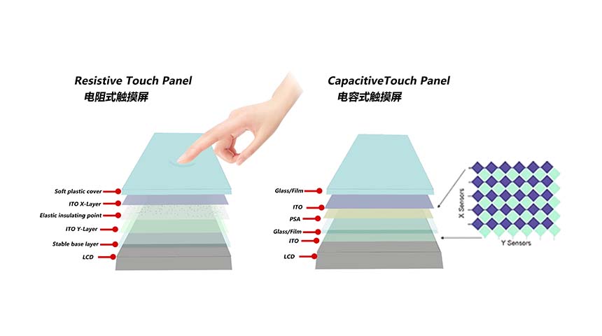
Capacitive vs Resistive Touch Screen Car Stereo: Which Is Right for You?
-
TN LCD vs IPS LCD: How to Choose the Right Display for You
-
Capacitive Touch Panel or Resistive: Which Suits Your Needs?
-
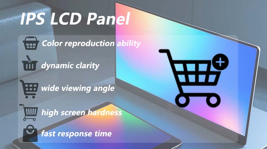
Why Choose an IPS LCD Panel for Your Next Screen Purchase?
-
CDTECH to Showcase Cutting-Edge Display Solutions at SID 2025
-
Comparing Different Types of Displays in Cars: A Detailed Overview
-
White Spots on LCD Screen: Causes, Fixes & Industrial Solutions (2026 Guide)